Styling Element States
Buttons, links, and interactive elements often look different when hovered, focused, or clicked. Dazl lets you lock an element into a specific state and style it directly — a capability that static design tools can't offer.
Buttons, links, and interactive elements often look different when hovered, focused, or clicked. Dazl lets you lock an element into a specific state and style it directly — a capability that static design tools can't offer.
Selecting a State
- In Edit mode, select an element
- In the Editing Toolbar, find the Element states control
- Check the state you want to style: Hover, Active, Focus, Focus visible, or Focus within. You can enable multiple states at once to preview combined interactions.
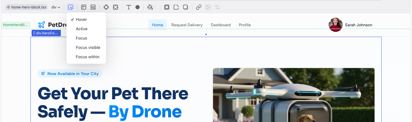
The preview locks the element into that state, so you can see and edit how it looks. For example, checking Hover on a button shows it as if your cursor were over it.
Editing a State
Once you've selected a state, use any of the toolbar controls to make changes:
- Change the text color or background color on hover
- Adjust borders or shadows for the focus state
- Modify typography for the active state
These changes are written as CSS pseudo-class rules (:hover, :focus, :active) in the source code, targeting that specific state.
Previewing States
After making your changes, uncheck all states in the state selector and then switch to Preview mode to interact with the element normally. Hover over the element to see your hover styles in action.
Designing interactive states is one of the areas where Dazl's web-native approach matters most. Static design tools let you mock up a hover state, but you can't actually hover to see how it feels. In Dazl, you're designing the real interaction.
Common State Styling Patterns
- Buttons — darken the background on hover, add a subtle shadow on focus
- Links — change color or add an underline on hover
- Cards — lift with a shadow on hover to suggest clickability
- Input fields — highlight the border on focus to show which field is active
Related Articles
- Visual Editing – selecting and editing elements in Edit mode
- The Editing Toolbar – full reference for toolbar controls
- Working with the Theme – use theme colors for consistent state styling
Working with the Theme
Every Dazl project includes a built-in design system with semantic tokens for colors and typography. The AI creates a theme tailored to your project, choosing the semantic color groups, the number of accent colors, and the base palettes based on what you're building. The examples below are just one possibility; your project's theme may look different.
Chat-Driven Editing
The Chat panel is where you work with the AI to make changes that go beyond what visual editing can do — adding features, restructuring layouts, changing logic, or building entirely new pages.