Working with the Theme
Every Dazl project includes a built-in design system with semantic tokens for colors and typography. The AI creates a theme tailored to your project, choosing the semantic color groups, the number of accent colors, and the base palettes based on what you're building. The examples below are just one possibility; your project's theme may look different.
Every Dazl project includes a built-in design system with semantic tokens for colors and typography. The AI creates a theme tailored to your project, choosing the semantic color groups, the number of accent colors, and the base palettes based on what you're building. The examples below are just one possibility; your project's theme may look different.
The Theme panel lets you view and modify these tokens, changing your project's look across every component at once.
How Tokens Work
Design tokens are named values that your project's components reference instead of hardcoded colors or sizes. When you change a token in the Theme panel, every component that uses it updates automatically. This means you can change your brand color once and see it across every button and link, switch between dark and light mode with consistent color relationships, and maintain visual consistency without updating individual components.
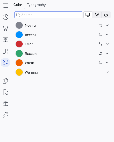
Color
The Color tab organizes colors into semantic groups. A project might include groups like:
- Neutral – backgrounds, text, borders
- Accent – brand color, interactive elements, highlights
- Error – error states, destructive actions
- Success – confirmation, positive states
- Warm – warm accent tones
- Warning – caution states
Your project may have fewer groups, more groups, or different names.
Color Scales
Click any color group to expand it and see 12 graded colors plus a Contrast swatch (a white or black that pairs well with the group's colors). Each step maps to a CSS custom property named after the base color. For example, an accent group based on blue uses --blue-1 through --blue-12 plus --blue-contrast.
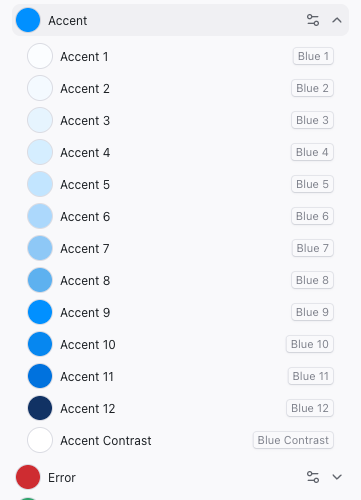
Lighter steps (1–4) are typically used for backgrounds, mid steps (5–8) for borders and secondary elements, and darker steps (9–12) for text and primary elements. The Contrast swatch is designed to look good against color 9, which is the highest chroma color in the palette, useful for text on buttons and other high-contrast surfaces.
Changing Brand Colors
To change a color group (for example, shifting your brand accent from blue to lime), click the controls icon next to the group name. A popup appears with a grid of base colors to choose from. Pick one and Dazl regenerates the entire 12-step scale automatically, keeping the relationships between shades consistent.
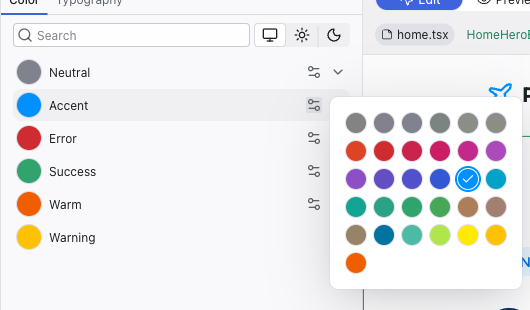
Change the accent color once and see it reflected everywhere: buttons, links, highlights, and interactive elements across the entire project. It's a quick way to explore brand directions.
Press Cmd+Z (Mac) or Ctrl+Z (Windows) to undo a theme change if you don't like the result.
Light and Dark Mode
At the top of the Color tab, use the System / Light / Dark toggle to preview your colors in different modes. This only changes the preview. The color tokens adapt so you can see how your design looks in each mode. To switch the entire editor to light or dark mode, use the project menu at the top left.
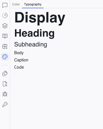
Typography
The Typography tab shows your project's type scales:
- Display – large, prominent text (hero headlines)
- Heading – section headings
- Subheading – secondary headings
- Body – paragraph text
- Caption – small labels and metadata
- Code – monospace text for code snippets
Each scale shows a live preview of the font at its configured size and weight.
Related Articles
- The Editing Toolbar – use theme tokens when editing individual elements
- Styling Element States – apply theme colors to hover and focus states
- Theme – full reference for the Theme panel
The Editing Toolbar
The Editing Toolbar appears below the top bar when you select an element in Edit mode. It gives you direct control over an element's appearance — click any icon to open its panel, make your changes, and the result is immediately visible in the preview and saved to the source code.
Styling Element States
Buttons, links, and interactive elements often look different when hovered, focused, or clicked. Dazl lets you lock an element into a specific state and style it directly — a capability that static design tools can't offer.