The Editing Toolbar
The Editing Toolbar appears below the top bar when you select an element in Edit mode. It gives you direct control over an element's appearance — click any icon to open its panel, make your changes, and the result is immediately visible in the preview and saved to the source code.
The Editing Toolbar appears below the top bar when you select an element in Edit mode. It gives you direct control over an element's appearance — click any icon to open its panel, make your changes, and the result is immediately visible in the preview and saved to the source code.

Knowing Where You Are
The left side of the toolbar always shows a file breadcrumb and component name (e.g., home.tsx > HomeHeroBlock). This is useful context: it tells you which file your changes will affect, and gives you the exact component name to reference if you switch to the Chat panel.
Adjusting Spacing and Layout
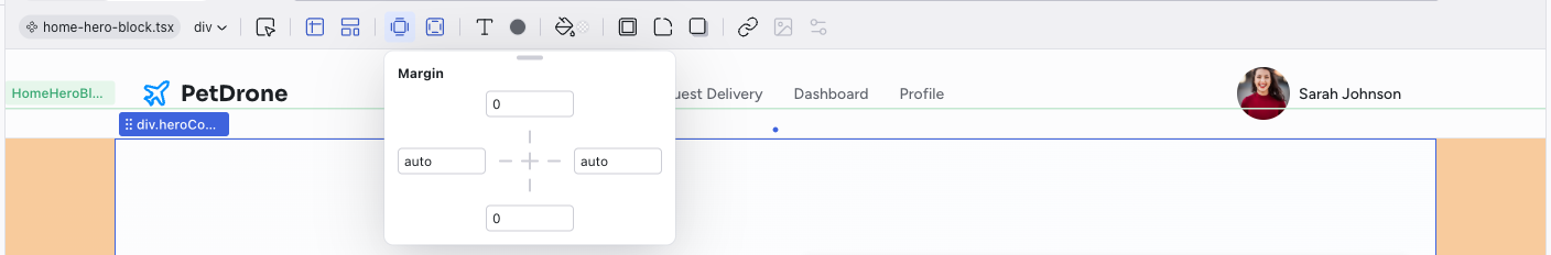
When an element doesn't feel right spatially — too cramped, too far from a neighbor, or not aligned the way you want — start with Margin and Padding. The visual four-sided editor makes it clear which side you're adjusting, and you can link sides to edit them in pairs or all at once.
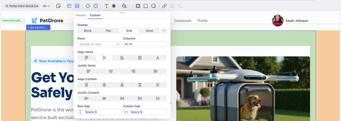
For structural changes, use the Layout panel. If you want a row of items, pick Horizontal Stack. For a column, Vertical Stack. The grid presets are helpful for card layouts. If you need finer control, switch to the Custom tab for full flexbox and grid properties.
Working with Colors
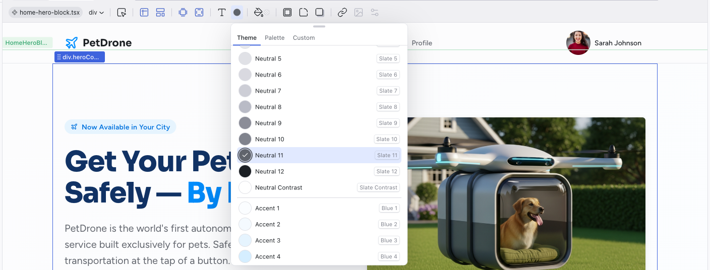
The color pickers (for both Text Color and Background) offer three ways to pick a color:
- Theme tab — your project's design tokens. This is the best default choice because it keeps your project consistent. If you later change a token in the Theme panel, every element using it updates automatically.
- Palette tab — useful when you want to explore a broader range of colors without committing to a custom value.
- Custom tab — for precise color control. The eyedropper tool is handy for sampling a color from somewhere else in your design.
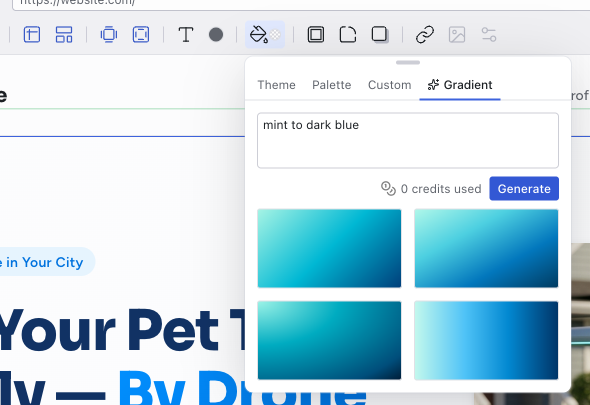
For backgrounds, there's also a Gradient tab where you describe what you want in plain language ("warm sunrise", "mint to dark blue") and the AI generates it.
Prefer theme tokens over custom colors whenever possible. They keep your project visually coherent and make future theme changes painless.
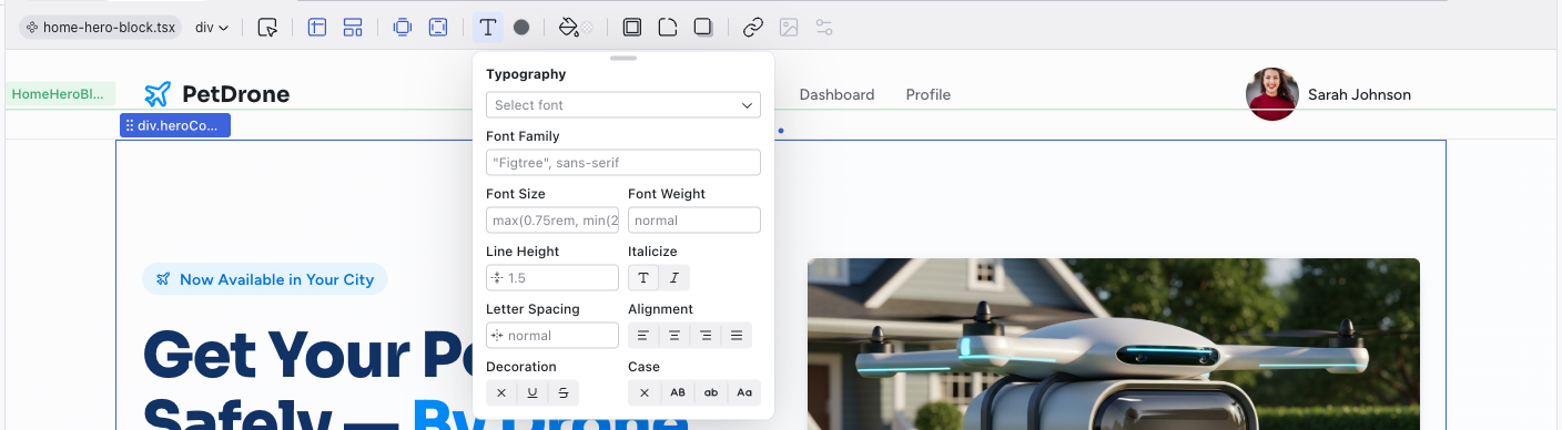
Styling Text
The Typography panel lets you adjust font family, size, weight, line height, alignment, and more. The dropdown at the top pulls from your theme's font presets, which is the easiest way to keep typography consistent. Use the individual controls below when you need to override a specific property.
Adding Polish
The Border, Corners, and Shadow controls handle visual refinement. Corners use your theme's radius scale, so buttons and cards stay consistent. Shadows come as numbered presets — start with Shadow 1 for subtle depth and go higher for more dramatic effects.
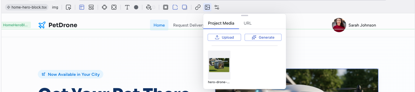
Handling Images and Icons
Media activates when you select an image. You can replace it with another image from your project, upload a new one, paste a URL, or generate one with AI. Double-clicking an image in the preview opens this panel directly.
When you select an SVG icon, the SVG Element control appears instead, letting you browse the Lucide icon library for a replacement.
When to Use the Toolbar vs. the Chat
The toolbar is ideal for visual tweaks you can point to: adjusting a color, increasing padding, changing a font size, replacing an image. These changes are instant, precise, and don't consume credits.
For anything structural — rearranging components on a page, adding new sections, changing how data flows, or refactoring multiple elements at once — the Chat panel is more effective. The AI can reason about your project's architecture in ways that go beyond individual CSS properties.
A good workflow: use the toolbar for targeted refinements, and the chat for bigger changes.
Related Articles
- Visual Editing – selecting and manipulating elements in Edit mode
- Visual Editing – full reference for every toolbar control
- Styling Element States – editing hover, focus, and active states
- Working with the Theme – customize colors and typography at the project level
Visual Editing
Edit mode lets you select, move, and modify elements directly on the live preview — no prompts, no code, no credits.
Working with the Theme
Every Dazl project includes a built-in design system with semantic tokens for colors and typography. The AI creates a theme tailored to your project, choosing the semantic color groups, the number of accent colors, and the base palettes based on what you're building. The examples below are just one possibility; your project's theme may look different.