Your First Project
This walkthrough takes you from a blank prompt to an interactive prototype you can edit, inspect, and share — covering the core of what Dazl does.
This walkthrough takes you from a blank prompt to an interactive prototype you can edit, inspect, and share — covering the core of what Dazl does.
Create a Project
From the Dashboard, type a description of what you want to build in the prompt box. Be as specific or general as you like — you can always refine later.
For example:
"Build me an application that's a clone of Uber but uses drones instead of cars and is for pets instead of people"
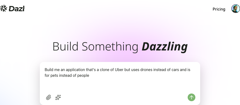
Click the Send button. Dazl generates a complete project and opens it in the Editor.
Explore the Editor
The Editor has three main areas:
- Left sidebar — tabbed panels for Chat, History, Elements, Specs, and more
- Center area — your live preview, plus tabs for code and spec files
- Top bar — project menu, Edit / Preview toggle, page navigation, and action buttons
The Chat panel is open by default, showing the conversation that generated your project. The center area shows a live, interactive preview of what was built.
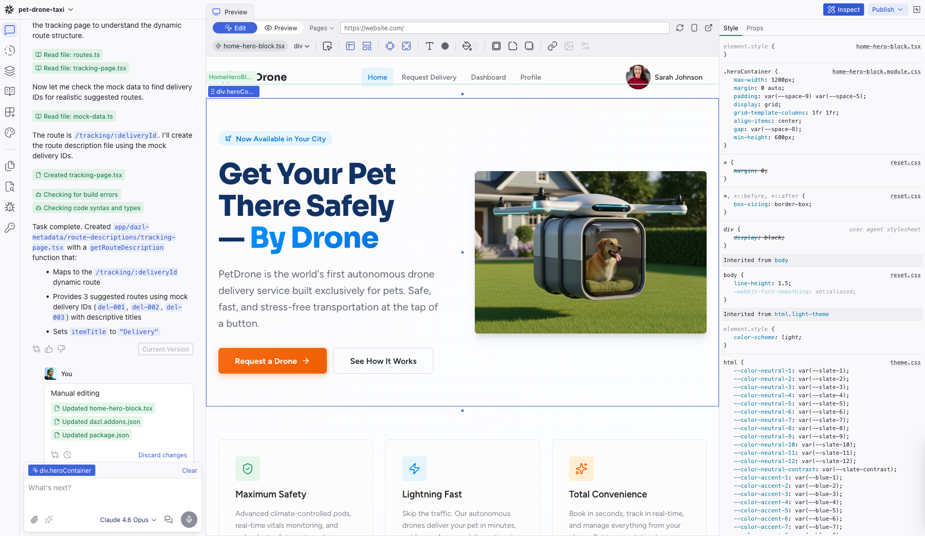
Try clicking links and interacting with the preview — it's a real running application, not a static mockup.
The preview runs on a real virtual server. If your project includes forms, authentication, or API calls, they work as expected.
Start Editing
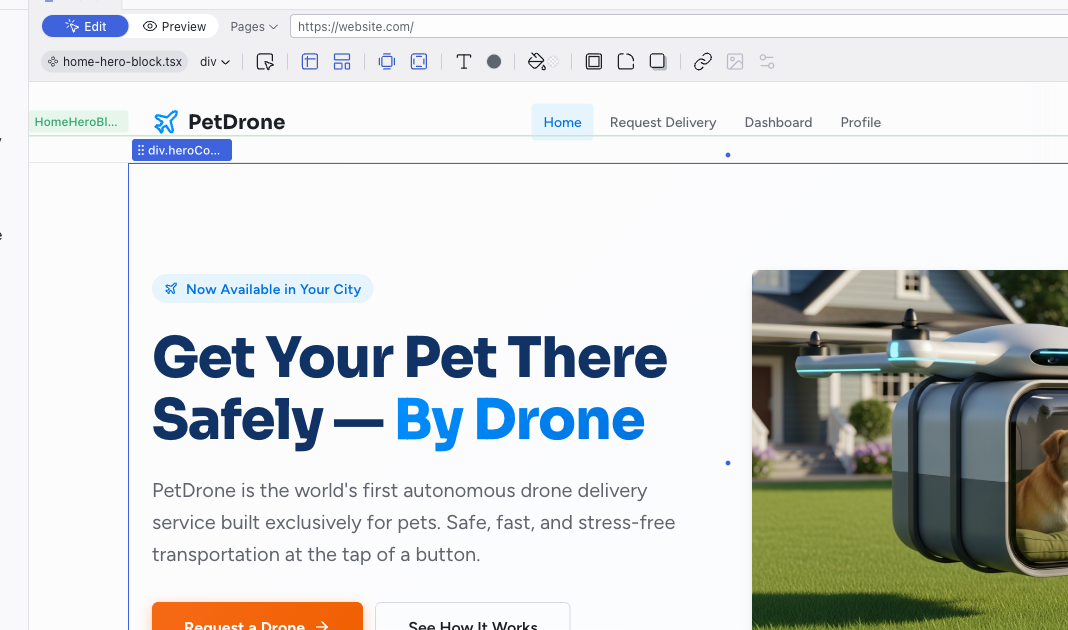
At the top of the center area, the Edit / Preview toggle controls how you interact with the preview. Preview mode is fully interactive — click links, fill out forms, and navigate between pages as a real user would. Edit mode lets you select and manipulate elements visually.
The editor opens in Edit mode by default. Click any element in the preview to select it:
- A blue outline marks the selected element; a green outline marks its parent component
- The element's name appears as a breadcrumb in the Editing Toolbar
- Double-click a component to drill into its inner elements
- Hold Cmd (Mac) or Ctrl (Windows) and click to select any deeply nested element directly
- Your selection is automatically sent to the AI as context in the Chat panel
Try these visual editing actions:
- Click any element to select it
- Double-click text to edit it directly
- Drag elements to reposition them
- Use the Editing Toolbar that appears below the top bar to change colors, typography, spacing, and more
Every visual change you make is immediately reflected in the source code — no AI call needed, no credits consumed.
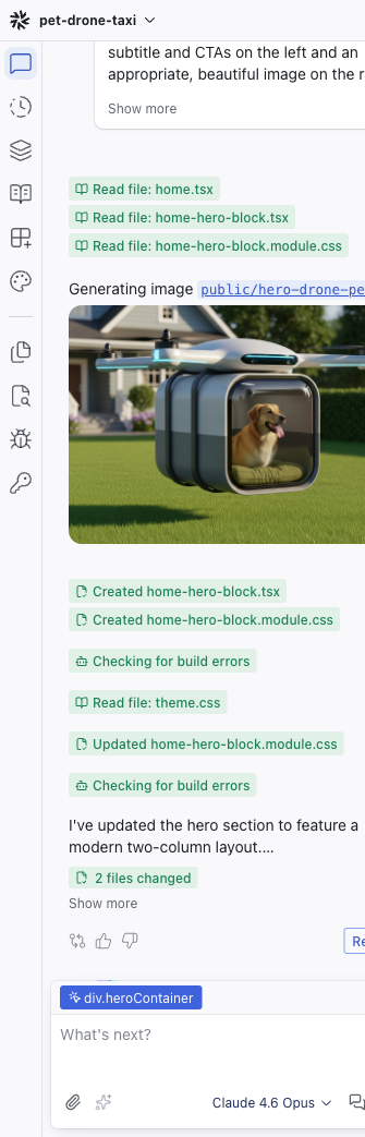
Ask the AI to Make Changes
Switch back to the Chat panel in the left sidebar. With an element selected on the preview, you'll see it appear as a chip above the prompt box (e.g., HomeHeroBlock.homeheroblock), giving the AI context about what you're working on.
Type a request in the prompt box:
"Change the hero headline to 'Fresh Meals, Delivered by Drone' and make the call-to-action button use the accent color"
The AI makes the changes and shows you exactly what files were modified. You can expand the file cards in the chat to see diffs of every change.
Inspect What Was Built
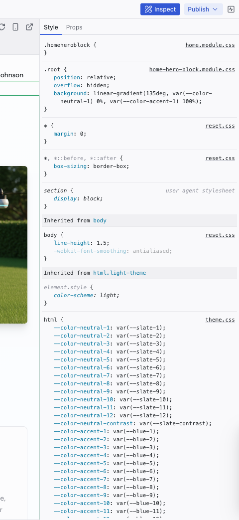
Click the Inspect button in the top-right corner of the top bar to open the Inspect panel on the right side.
With an element selected, the Style tab shows every CSS rule affecting it — grouped by source file, editable inline. The Props tab shows the React component's properties.
This works like browser DevTools, but with readable source names and edits that persist in your project's source code.
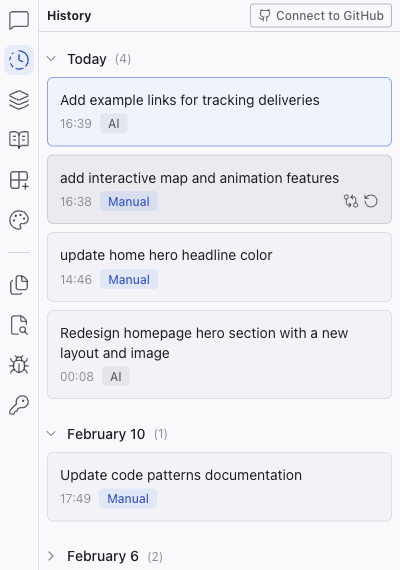
Review History
Click the History tab in the left sidebar to see a timeline of every change made to your project — AI-generated, visual edits, and manual code changes.
Each revision has a View changes button to see the diff and a Restore button to roll back to that point. You always know exactly what changed and when.
What's Next
You've covered the core loop: prompt, preview, edit, chat, inspect, review. From here, you can:
- Refine your design — use the Theme panel to adjust colors and typography across the entire project
- Write specs — define your requirements in the Specs panel to guide the AI more precisely
- Add integrations — connect Supabase for a database or Figma for design imports
- Share your work — publish your interactive prototype or connect to GitHub for handoff
Related Articles
- Visual Editing – deeper dive into Edit mode and visual manipulation
- Chat-Driven Editing – how to get the best results from the AI
- The Editor Layout – full reference for every part of the editor workspace