Elements
The Elements panel shows a tree view of your project's component hierarchy for the current page. Click any node to select the corresponding element on the preview.
The Elements panel shows a tree view of your project's component hierarchy for the current page. Click any node to select the corresponding element on the preview.
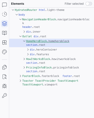
Tree View
- Component names (e.g.,
NavigationHeaderBlock,HomeHeroBlock) and CSS class names displayed in their original source names - Expandable/collapsible hierarchy
- Click a node to select the element on the preview and in the Inspect panel
- Useful for selecting elements that are hard to click directly on the preview
Filter Selected
The Filter selected toggle at the top of the panel narrows the tree to show only the selected component and its children. This is useful when you're working inside a deeply nested component and want to focus without the surrounding tree nodes.
Context Menu
Right-click any element in the tree to open a context menu with quick actions.
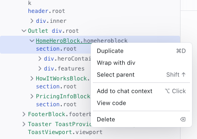
| Action | Shortcut | Description |
|---|---|---|
| Duplicate | Cmd/Ctrl+D | Copy the element and insert it after the original |
| Wrap with div | — | Wrap the element in a new <div> container |
| Select parent | Shift+↑ | Move the selection up to the parent element |
| Add to chat context | Alt/Option+Click | Attach the element as context in the Chat prompt |
| View code | — | Open the element's source file in the code editor |
| Delete | Backspace | Remove the element from the page |
Related Articles
- The Elements Tree – guide to using the elements tree
- Inspecting Your Project – see styles and props for selected elements
History
The History panel shows a timeline of every change made to your project, with the ability to view diffs and restore previous versions.
Specs
The Specs panel is a file browser for your project's specification files: markdown documents that guide the AI's behavior when generating and modifying code.