Inspect
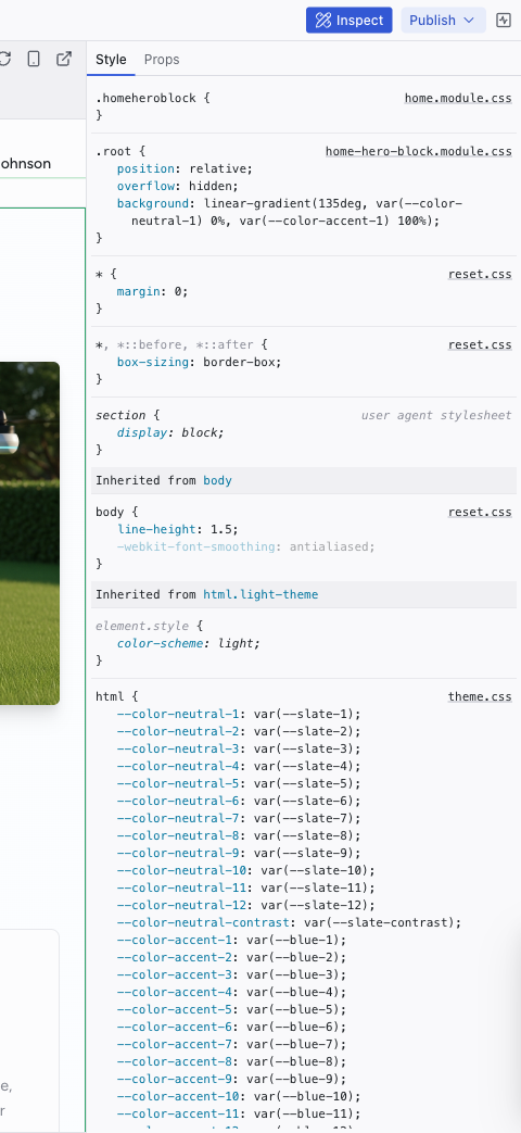
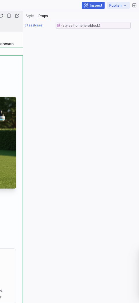
The Inspect panel opens on the right side of the editor and shows detailed information about the currently selected element. It has two tabs: Style and Props.
The Inspect panel opens on the right side of the editor and shows detailed information about the currently selected element. It has two tabs: Style and Props.
Style Tab
Shows every CSS rule affecting the selected element, ordered from most specific to least specific. Rules are grouped by source file:
- Project stylesheets – your component and page styles (e.g.,
home-hero-block.module.css,home.module.css) - Theme files – design tokens defined in
theme.css,colors.css,typography.css,spacings.css,decorations.css,animations.css - Reset and base styles –
reset.css,global.css - User agent stylesheet – browser default rules (read-only)
Click any value to edit it inline. Changes are written directly to the source file.
The Style tab also shows inherited styles from parent elements (e.g., "Inherited from body", "Inherited from html.light-theme"), so you can trace where a style originates.
Props Tab
Shows React component props for the selected element:
- Prop name and current value
- Inline values (strings, numbers, objects, arrays) can be edited directly in the text input
- Bound expressions (e.g.,
{styles.homeheroblock}) show the expression and possibly the runtime value, but should be changed through the AI chat instead
Opening the Inspect Panel
Click the Inspect button in the top-right area of the top bar. Select an element in Edit mode to see its details.
Related Articles
- Inspecting Your Project – guide to using inspection effectively
- The Elements Tree – navigate the component hierarchy
- Visual Editing – edit the elements you're inspecting
Keys
The Keys panel manages environment variables and API keys for your project. Secrets stored here are available to your project's server code without being exposed to the AI or visible in the codebase.
Pages and Routing
The Pages dropdown in the top bar shows all the routes in your project and lets you navigate between them in the preview.